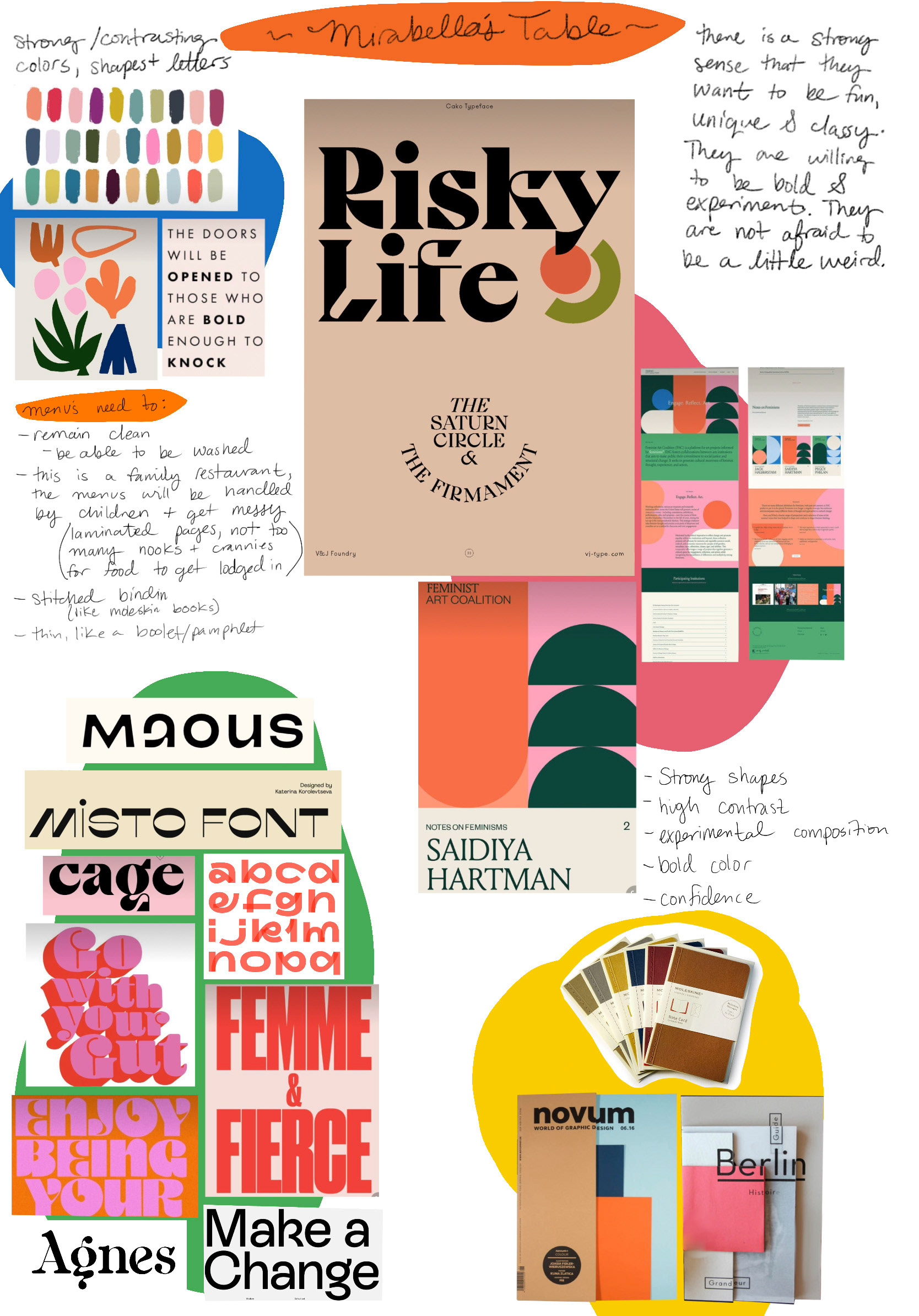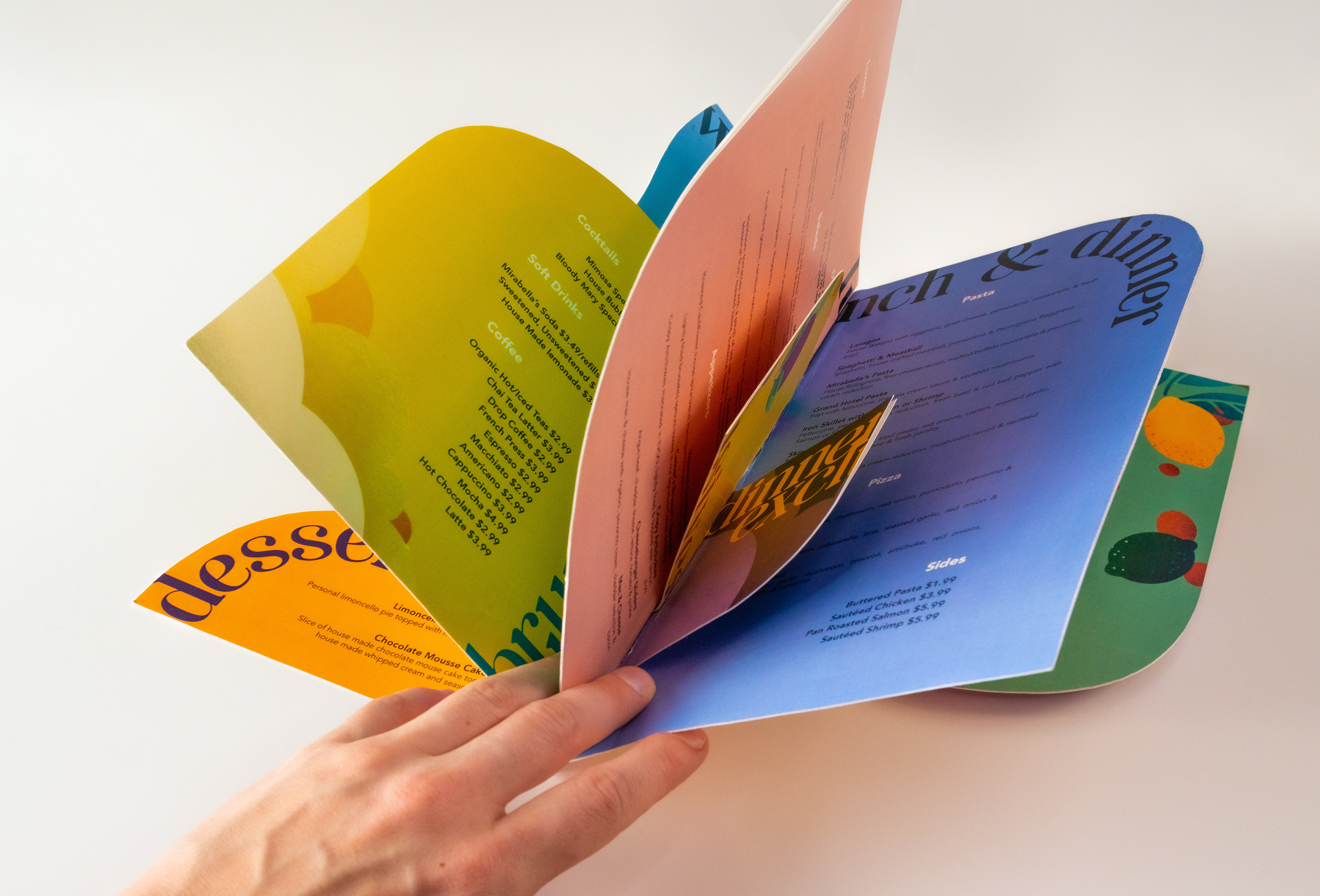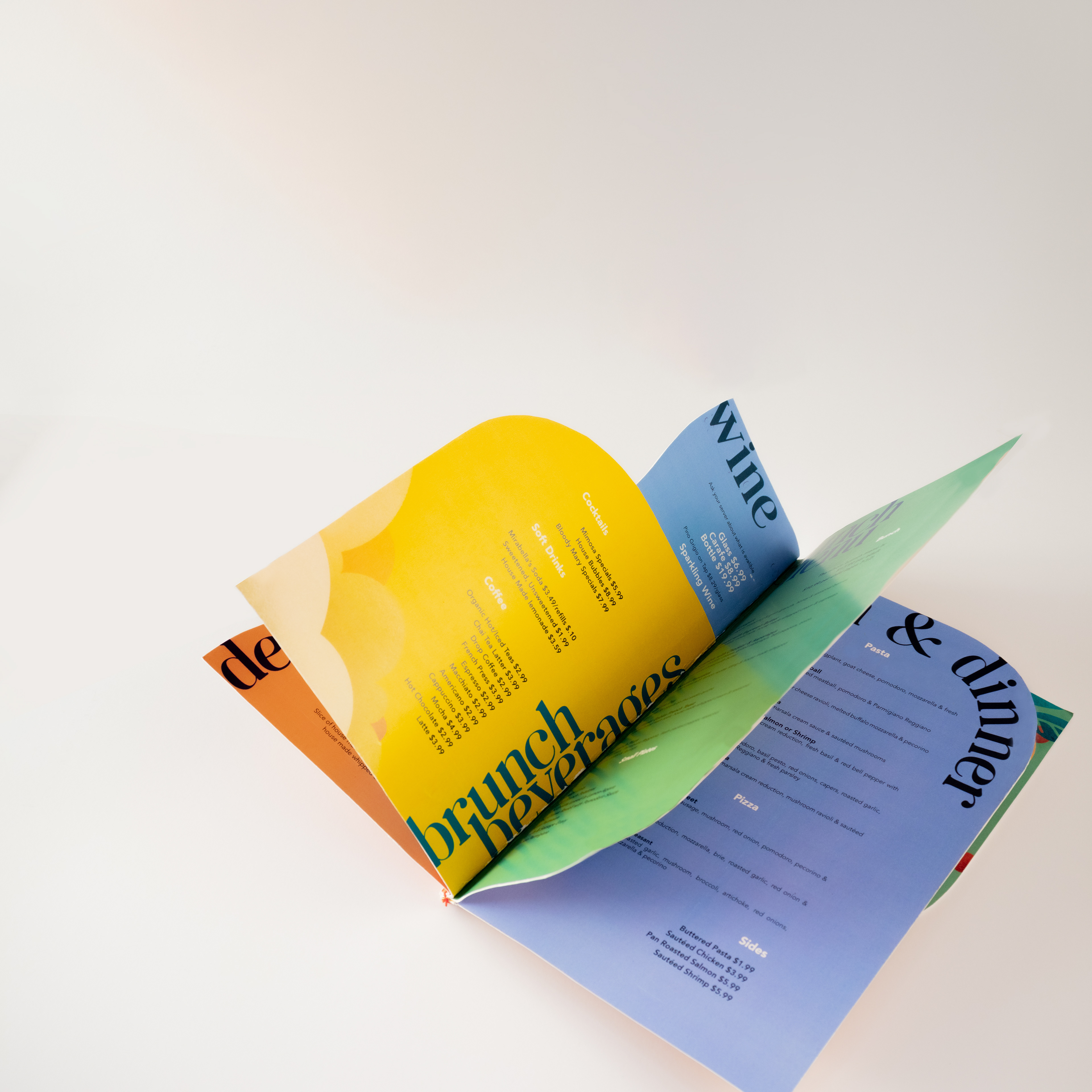
As a former server at Mirabella's Table in 2019, I felt a strong urge to redesign their menu. Having an intimate knowledge of the restaurant's culture and vibe made me uniquely suited for the task. The restaurant's warm and inviting atmosphere caters to a wide range of guests, from families to business meetings. To appeal to such a diverse clientele, I aimed to capture the fun-loving voice of the restaurant and design a menu that would reflect that.
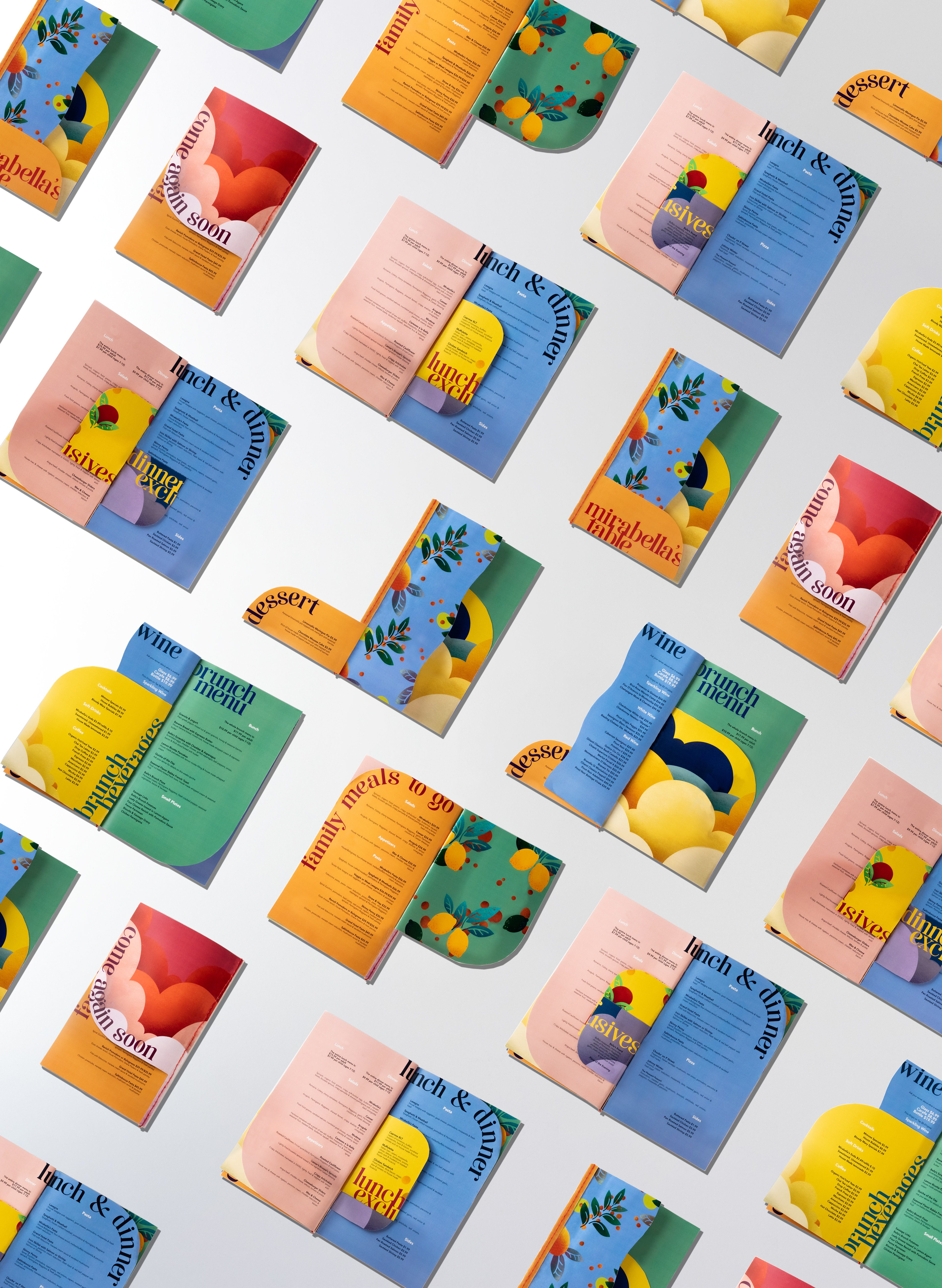
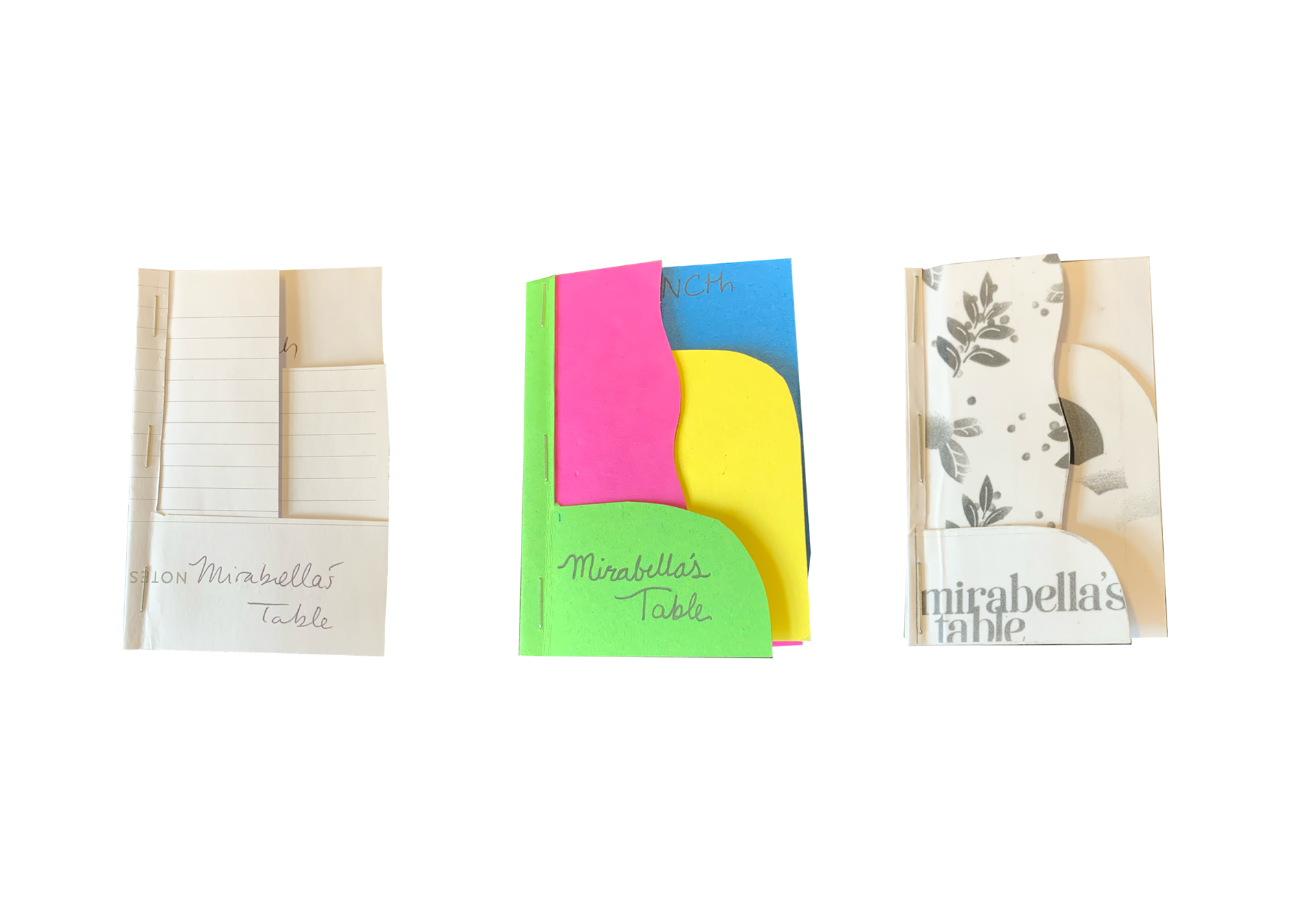
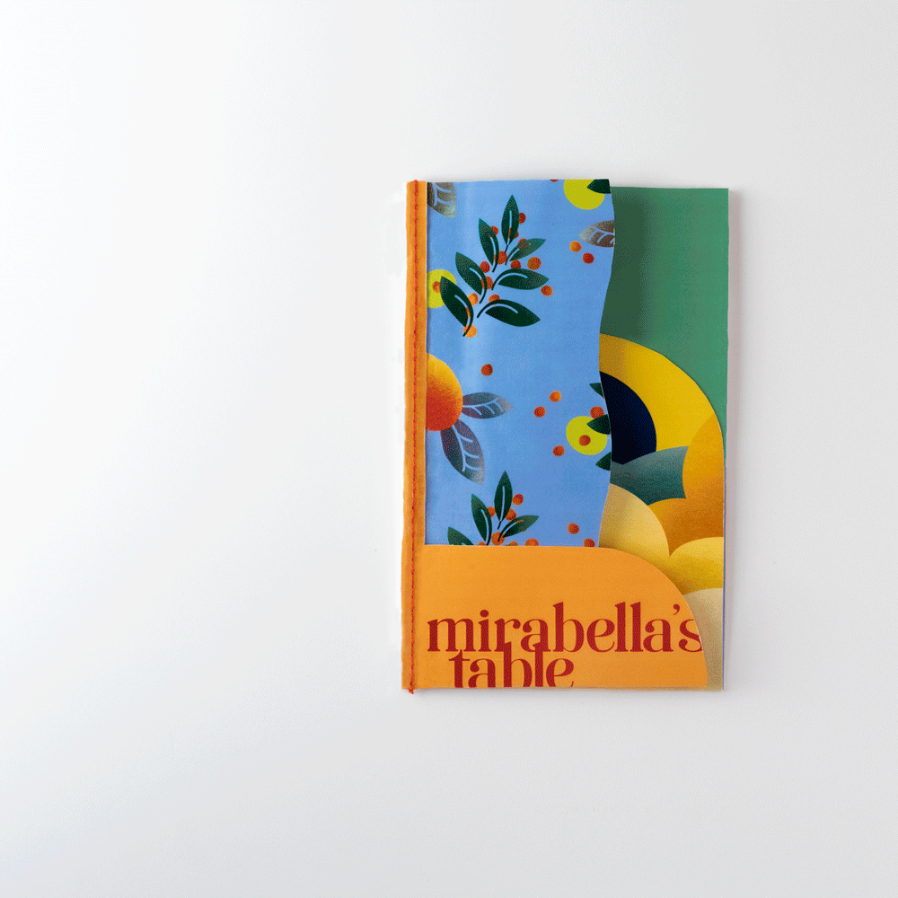
I achieved this by creating an exciting layout that played on the variety of their menu and incorporated playful illustrations of fruits and whimsical, colorful clouds inspired by the restaurant's botanical roots. The display font was both elegant and playful, with a reserved body type that provided a visually interesting experience for patrons of all ages.
To make the menu functional, I chose to laminate the pages to preserve their color and allow for easy cleaning without damaging the print. The stitched binding provided a strong, flexible spine that stayed clean and didn't catch debris, and the slim shape made for easy stacking, carrying, and storing.
While the production of the menu was somewhat expensive due to the dye-cut print and binding, I knew that the owner of the restaurant would be willing to invest in upgrading his menus to enhance the customer experience. This project allowed me to exercise my design skills and work with a real-life client to create something that both the restaurant and its patrons could enjoy!